
Data Logger - Part 3 - Visualization
Introduction
This is the third in a series of posts to build a simple data logger system for temperature and relative humidity.
Posts in the series:
- Part 1 - Hardware - build a data logger for recording temperature and humidity using a Raspberry Pi
- Part 2 - Storage - send data to an Amazon Timestream database
- Part 3 - Visualization - viewing your data in a graphical form
Libraries
The following libraries are used in the script:
- awswrangler - queries date from Amazon Timestream database.
- matplotlib - used for plotting data.
- pandas - provides powerful data structures and data analysis tools to deal with datasets (included with awswrangler).
import awswrangler as wr

from matplotlib import pyplot as plt
Setup Constants
DATABASE_NAME = "DataLoggerDB"
TABLE_NAME = "IoT"

QUERY_DATE = "2021-11-15"
QUERY_SENSOR = "001"
Get Data
Uses awswrangler to query data and put into a Pandas DataFrame.
# Get date from Timestream database
SELECT_SQL = f"SELECT * FROM {DATABASE_NAME}.{TABLE_NAME} WHERE SensorId = '{QUERY_SENSOR}' AND DATE(time) = '{QUERY_DATE}' ORDER BY time ASC"

df = wr.timestream.query(SELECT_SQL)

print('Raw data from Timestream')
print(df)
Clean Data
Steps to clean the data before it is plotted.
# Data cleaning - Remove date and seconds
df['time'] = df['time'].apply(lambda t: t.strftime('%H:%M'))
# Data cleaning - Pivot table so Temperature and Relative Humidity are columns
df = df.pivot(index="time", columns="measure_name", values="measure_value::double")
df.reset_index(inplace=True)
# Data cleaning - Remove rows where there null values
df.dropna()
# Data cleaning - Smooth out data before plotting
df['Temperature'] = df['Temperature'].interpolate(method='polynomial', order=2)
df['Relative Humidity'] = df['Relative Humidity'].interpolate(method='polynomial', order=2)
print('Cleaned data for plotting')
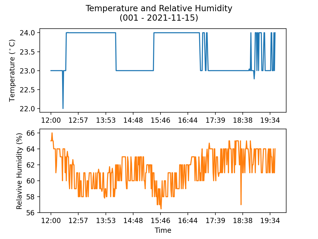
print(df)Plot Data
Plot the cleaned data using matplotlib.
# Plot data
figure, axes = plt.subplots(2)

figure.suptitle(f'Temperature and Relative Humidity\n({QUERY_SENSOR} - {QUERY_DATE})')

df.plot(kind='line',x='time',y='Temperature', ax=axes[0], color='tab:blue', legend=None)
df.plot(kind='line',x='time',y='Relative Humidity', ax=axes[1], color='tab:orange', legend=None)

axes[0].set_ylabel('Temperature ($^\circ$C)')
axes[0].set_xlabel(None)
axes[1].set_ylabel('Relavive Humidity (%)')
axes[1].set_xlabel('Time')

plt.show()
Usage
$python3 data_plotting.pyDisplays the raw data from the Timestream database.
Raw data from Timestream

    SensorId  Unit Location       measure_name                    time  measure_value::double
0        001  DegC   Office        Temperature 2021-11-15 12:00:00.944                   23.0
1        001     %   Office  Relative Humidity 2021-11-15 12:00:05.976                   65.0
2        001  DegC   Office        Temperature 2021-11-15 12:01:19.028                   23.0
3        001     %   Office  Relative Humidity 2021-11-15 12:01:24.388                   65.0
4        001  DegC   Office        Temperature 2021-11-15 12:02:30.264                   23.0
..       ...   ...      ...                ...                     ...                    ...
633      001     %   Office  Relative Humidity 2021-11-15 18:32:16.509                   62.0
634      001  DegC   Office        Temperature 2021-11-15 18:33:21.821                   23.0
635      001     %   Office  Relative Humidity 2021-11-15 18:33:26.713                   65.0
636      001  DegC   Office        Temperature 2021-11-15 18:34:34.591                   23.0
637      001     %   Office  Relative Humidity 2021-11-15 18:34:39.462                   57.0

[638 rows x 6 columns]
Displays the cleaned data ready for plotting.
Cleaned data for plotting

measure_name   time  Relative Humidity  Temperature
0             12:00          65.000000         23.0
1             12:01          65.000000         23.0
2             12:02          66.000000         23.0
3             12:03          65.000000         23.0
4             12:05          65.000000         23.0
..              ...                ...          ...
343           18:30          63.644859         23.0
344           18:31          62.000000         23.0
345           18:32          62.000000         23.0
346           18:33          65.000000         23.0
347           18:34          57.000000         23.0

[348 rows x 3 columns]
Final plot displaying tha data.
Summary
This post describes now to visualize the Temperature and Relative Humidity readings from the sensor attached to the Raspberry Pi from the data logged to the Amazon Timestream database.
The code for this post is available on GitHub.