
COVID-19 - Ireland Cases
Introduction
The Irish government has made available several datasets relating to the COVID-19 pandemic. These are available at the Ireland’s COVID-19 Data Hub.
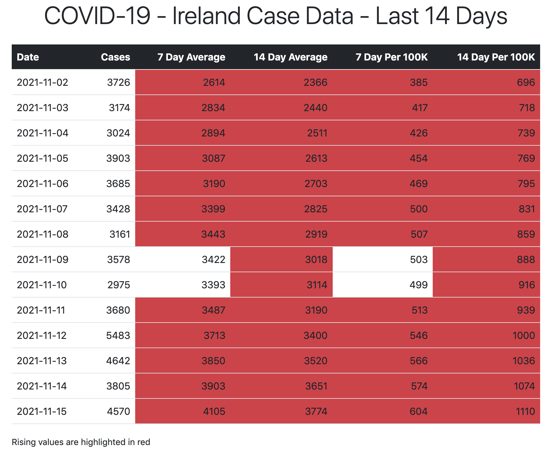
This example looks at how you can download and produce visualisations of the daily case numbers using a Python script. The output from the script is a HTML file (covid-19-ie-cases.html) containing a table of cases with calculated 7 and 14 day averages over the last 14 days and a plot of those values.
Libraries
The following libraries are used in the script:
- requests - allows sending HTTP requests through Python, which will be used to obtain the dataset from the internet.
- pandas - open-source Python library that provides powerful data structures and data analysis tools to deal with datasets.
- matplotlib.pyplot - used for data visualisation.
- matplotlib.dates - used for date formatting on data visualisations.
- jinja2 - web template engine for the Python.
import requests
import pandas as pd
import matplotlib.pyplot as plt
import matplotlib.dates as mdates
import jinja2
Define Constants
# Constants
POPULATION = 4757976 #2016 Census
DAYS = 14
DATA_URL = 'https://opendata.arcgis.com/datasets/d8eb52d56273413b84b0187a4e9117be_0.csv'
DATA_FILE = 'covid-19-ie-cases.csv'
HTML_FILE = "covid-19-ie-cases.html"
PNG_FILE = 'covid-19-ie-cases.png'
TEMPLATE_FILE = 'template.html'
Fetch Data
Download the latest version of the CSV file and load it into a Pandas DataFrame.
# Get latest data in csv format
data_content = requests.get(DATA_URL).content
csv_file = open(DATA_FILE, 'wb')
csv_file.write(data_content)
csv_file.close()
df = pd.read_csv(DATA_FILE)
Calculations
Calculate 7 and 14 day averages and numbers per 100,000 population.
df['Num7DayAverage'] = df['ConfirmedCovidCases'].rolling(7).mean()
df['Num14DayAverage'] = df['ConfirmedCovidCases'].rolling(14).mean()
df['Num7DayPer100K'] = df['ConfirmedCovidCases'].rolling(7).sum() / POPULATION * 100000
df['Num14DayPer100K'] = df['ConfirmedCovidCases'].rolling(14).sum() / POPULATION * 100000

df['Is7DayAverageRising'] = df['Num7DayAverage'].pct_change() > 0
df['Is14DayAverageRising'] = df['Num14DayAverage'].pct_change() > 0
df['Is7DayPer100KRising'] = df['Num7DayPer100K'].pct_change() > 0
df['Is14DayPer100KRising'] = df['Num14DayPer100K'].pct_change() > 0
Format Data
# Format columns
df['Date'] = pd.to_datetime(df['Date']).dt.date
df['Num7DayAverage'] = df['Num7DayAverage'].round(0).astype(pd.Int64Dtype())
df['Num14DayAverage'] = df['Num14DayAverage'].round(0).astype(pd.Int64Dtype())
df['Num7DayPer100K'] = df['Num7DayPer100K'].round(0).astype(pd.Int64Dtype())
df['Num14DayPer100K'] = df['Num14DayPer100K'].round(0).astype(pd.Int64Dtype())
Filter Data
# Filter data for table
df = df.tail(DAYS)
Generate HTML file
jinja2 uses template.html to format the data from the DataFrame using Bootstrap. It also creates a placeholder for the plot that will be created later in the script.
# Load template
templateLoader = jinja2.FileSystemLoader(searchpath="./")
templateEnv = jinja2.Environment(loader=templateLoader)
template = templateEnv.get_template(TEMPLATE_FILE)

# Convert DataFrame to dictionary
rows = (
    df
    .to_dict(orient='records')
)[:DAYS]

# Write HTML file
file = open(HTML_FILE, "w")
file.write (template.render(days=DAYS, rows=rows))
file.close()
Plot Data
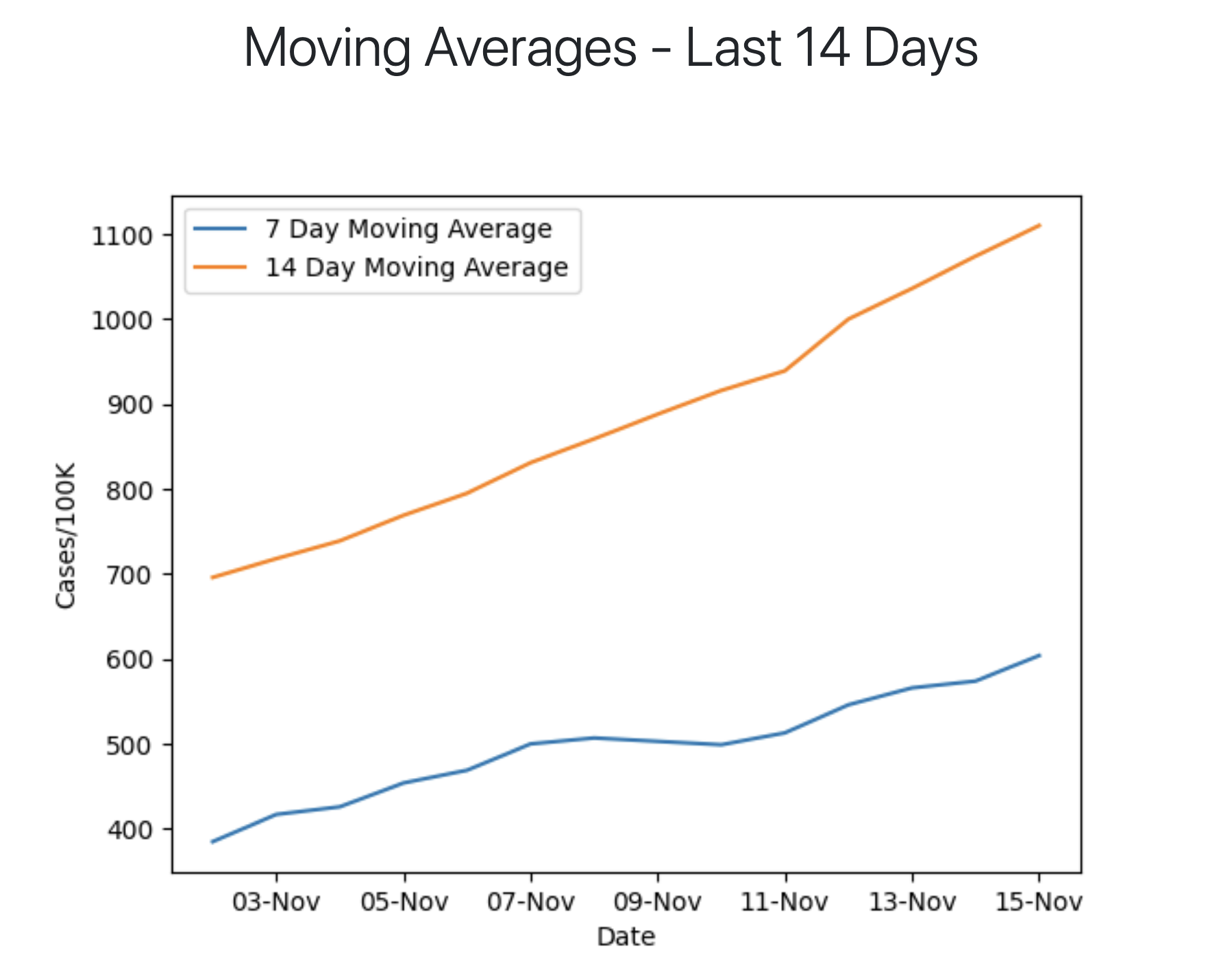
Plot data and save as a .png file that is included in the HTML template.
ax = plt.gca()
plt.gca().xaxis.set_major_formatter(mdates.DateFormatter('%d-%b'))
plt.ylabel('Cases/100K')
df.plot(kind='line',x='Date',y='Num7DayPer100K',ax=ax)
df.plot(kind='line',x='Date',y='Num14DayPer100K', ax=ax)
ax.legend(["7 Day Moving Average", "14 Day Moving Average"])
plt.savefig(PNG_FILE)
Full code for this example available on GitHub here.